Roxanna Skincare Serum Design
3 Days
Freelance
Promotional Poster
The design for the Roxanna Skincare Serum promotional visual embodies a vibrant and fresh aesthetic, aiming to capture the essence of skincare and beauty. This case study analyzes the design choices, color scheme, typography, and overall visual impact.
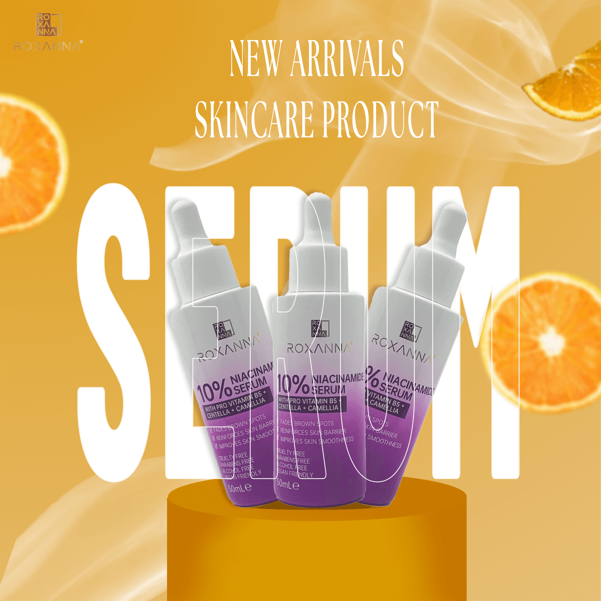
The primary goal of the design is to showcase the new arrivals of Roxanna's skincare product, specifically the Niacinamide Serum. The composition strategically uses key design elements to draw attention to the product while maintaining an engaging and visually appealing layout.
The color palette of the design is a combination of warm, energetic hues and cool, calming tones:
Primary Color: Warm orange (#E58E26) – This color represents vitality, freshness, and the citrus-based skincare ingredients, reinforcing a sense of nourishment and rejuvenation.
Secondary Color: White (#FFFFFF) – Used for typography and highlights, ensuring clarity and readability.
Accent Color: Deep Purple (#76479B) – Seen in the serum packaging, this color signifies luxury, sophistication, and a professional skincare brand.
Gradient Transition: The serum bottles display a transition from purple to white, creating a visually striking effect that aligns with modern skincare branding trends.
The typography used in the design includes a serif font for the main text, conveying a touch of elegance and professionalism:
"NEW ARRIVALS SKINCARE PRODUCT" – Displayed in an elegant serif font, enhancing sophistication.
"SERUM" – Large, bold, and placed in the background, creating a strong visual anchor that emphasizes the product category.
Serum Bottles: Positioned in the center with a subtle 3D effect, making them stand out and giving depth to the design.
Sliced Oranges: The floating orange slices reinforce the skincare benefits of Vitamin C, freshness, and natural ingredients.
Soft Smoke Effects: These elements add an ethereal and luxurious feel to the composition, enhancing the perception of premium skincare.
Podium Base: The golden platform on which the bottles stand creates a sense of prestige and highlights the importance of the product.
This design successfully communicates the essence of skincare innovation, luxury, and freshness. The combination of warm and cool tones, bold typography, and engaging visual elements makes the advertisement effective in attracting consumers.
Overall, the Roxanna Skincare Serum promotional design is a well-balanced composition that effectively conveys the product's benefits and premium quality. The strategic use of colors, typography, and imagery creates a visually appealing and engaging promotional piece that stands out in the beauty industry.