Shopora — E-Commerce Shopping Website

Project Overview
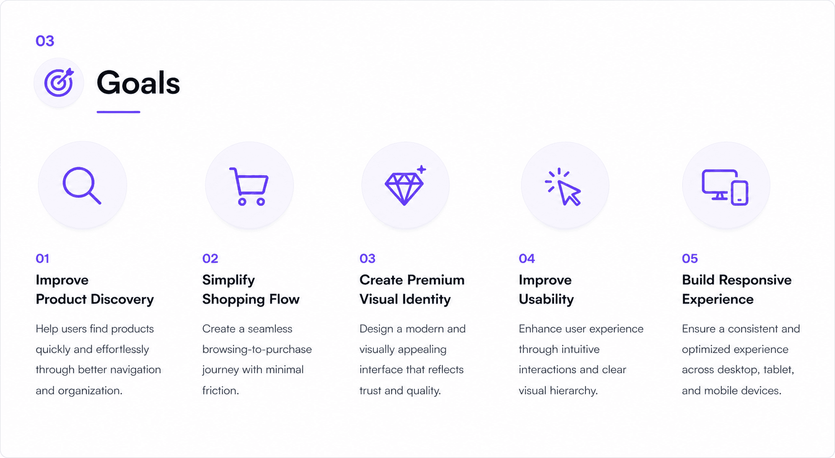
Shopora is a modern e-commerce website designed to provide a seamless and enjoyable shopping experience. The primary goal of this project was to create a clean, visually appealing platform that enables users to discover products effortlessly, navigate intuitively, and complete purchases through a smooth and efficient checkout process.
By combining a minimalist aesthetic with user-centered design principles, the website delivers an engaging shopping journey while maintaining clarity, accessibility, and ease of use across all devices.
Role: UI/UX Designer
Duration: 2 Weeks
Tools Used: Figma, Adobe Photoshop, Uizard
Project Type: E-Commerce Website Design
⚠️ The Problem
Many online shopping platforms struggle to provide a frictionless user experience, resulting in lower engagement and increased cart abandonment.
🗂️ Cluttered Interfaces
Overloaded layouts and excessive information make it difficult for users to focus on products and important actions.
🔍 Difficult Navigation
Poor categorization and complex navigation structures prevent users from finding products quickly and efficiently.
🛒 Complicated Checkout
Lengthy checkout processes create unnecessary friction and often lead to abandoned purchases before completion.
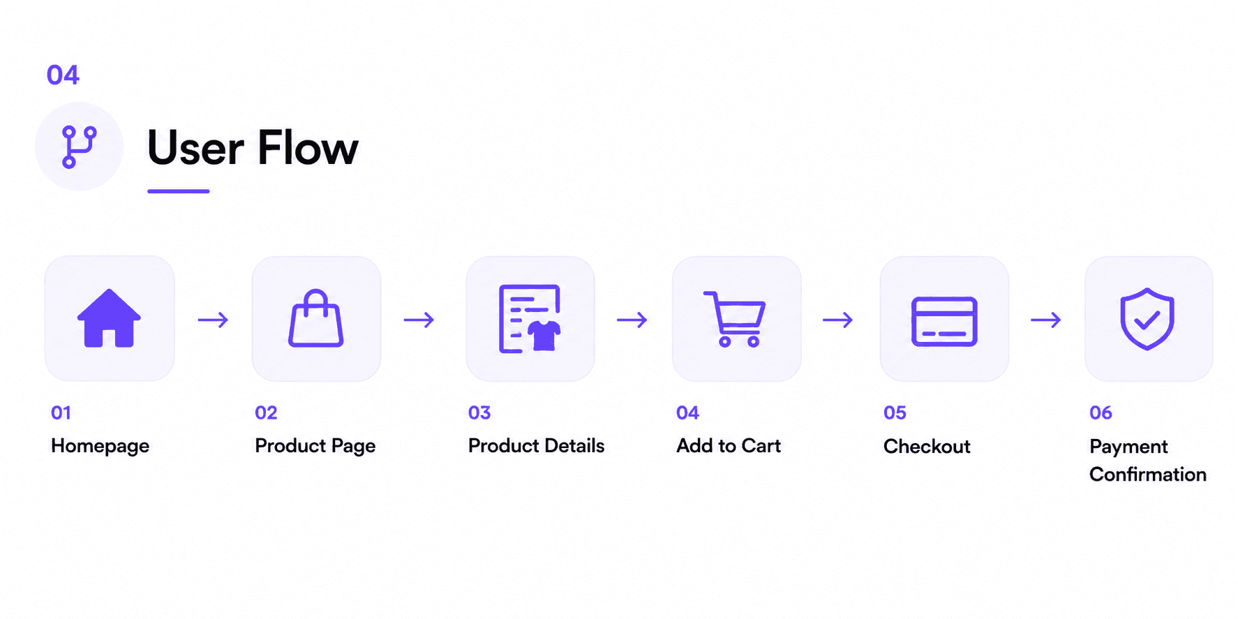
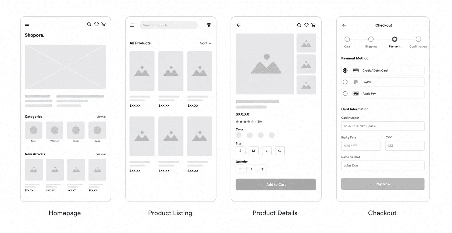
Wireframes
Low-fidelity wireframes were created to establish the overall information architecture, content hierarchy, and user journey before moving into visual design. This stage helped validate layouts, improve usability, and ensure a seamless shopping experience across key screens.
Included Screens
Homepage
Product Listing
Product Details
Checkout Flow
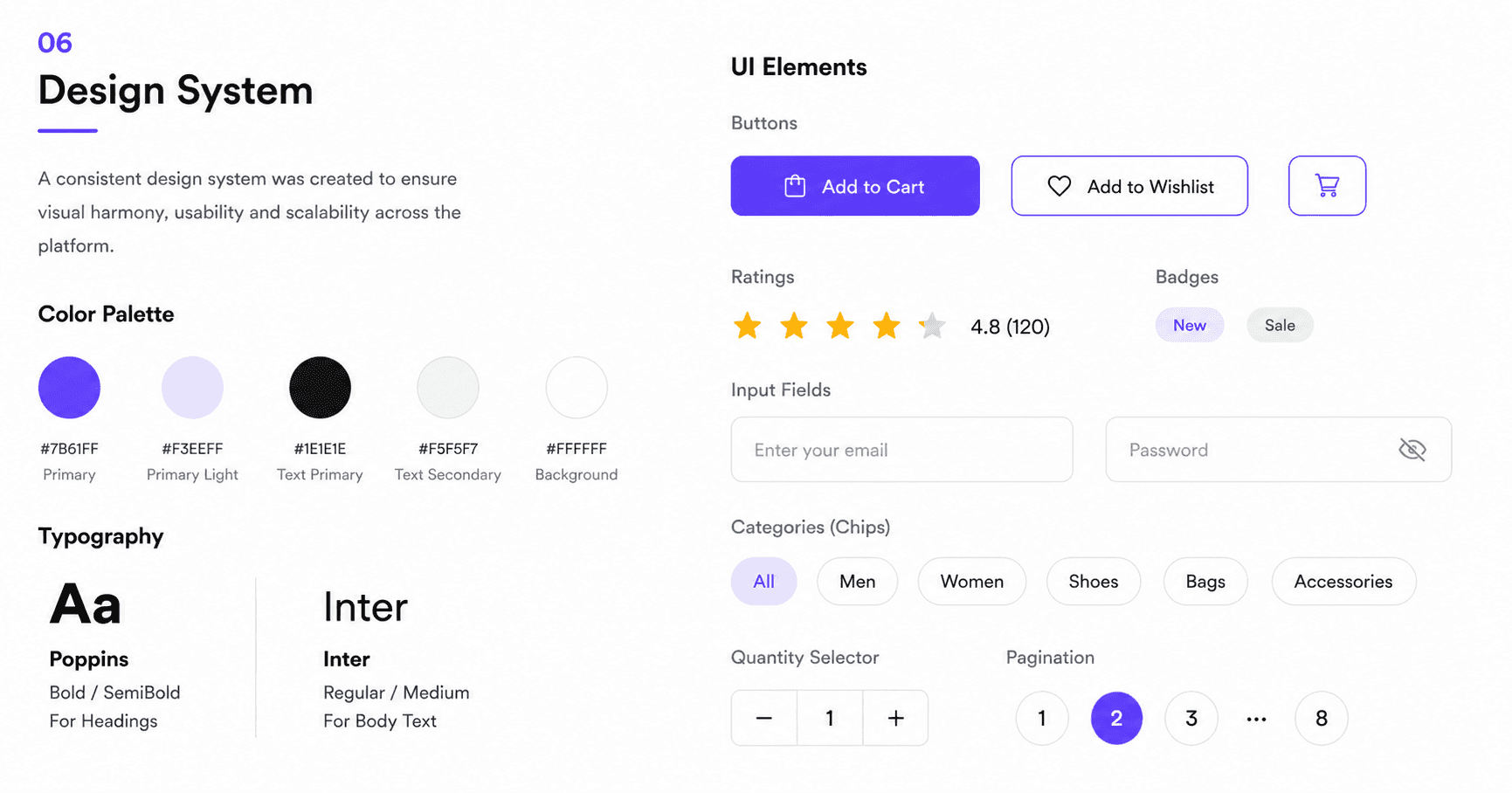
Design System
A scalable design system was created to maintain consistency across all screens and interactions.
🎨 Color Palette
A modern combination of soft neutrals and vibrant purple accents was used to establish visual hierarchy and reinforce brand identity.
🔤 Typography
Poppins was selected for headings to create strong visual impact, while Inter was used for body text to ensure readability and accessibility.
🧩 Components
Reusable buttons, cards, inputs, and navigation components were designed to ensure consistency and scalability.
🖥️ Homepage Design
The homepage was designed to immediately capture user attention through a strong hero section, featured categories, promotional banners, and best-selling products while maintaining a clean and organized layout.
Homepage Highlights
◉ Clean hero section with strong visual hierarchy
◉ Categories for quick navigation
◉ Featured products to boost discovery
◉ Trust badges for better user confidence